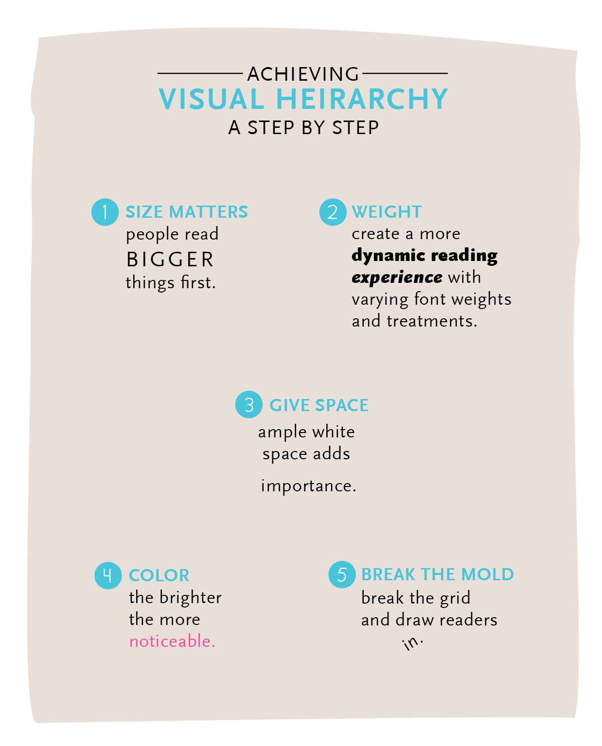
Hierarchy is the most important part of any multifaceted design. It’s important to organize the information is a way that will focus the reader/viewer on the most important information and to have a good flow throughout. Here are a few tips that will help you achieve the right kind of hierarchy each time every time you sit down to design.
- Size Matters: People read bigger things first! This should go without saying, but it’s important to remember. The elements that are most important should be the largest on the page.
- Weight: Size and weight go hand-in-hand when drawing the reader in. Weight is a great way to break up a set of text that is all the same size to draw readers to certain points.
- Give Space: Sometimes it’s what you don’t add that adds hierarchy. Setting an important piece of information on it’s own or surrounded by lots of white space will draw people in.
- Color: Another seemingly no-brainer. The brighter and more saturated your colors on your important information, the more quickly noticeable it will be.
- Break The Mold: Most design is laid on a vertical and horizontal grid. Breaking that grid will draw people to the disruption.