Type is an intricate and crucial part of graphic design. Any design worth his or her weight would tell you that a letter is more than ink printed on the page. Type is a body of it’s own(excuse the bad pun), and a big part of understanding the wide world of typography and type design is understanding the anatomy and terminology of it. Below is the first in the Village Copier Series on the anatomy of type.
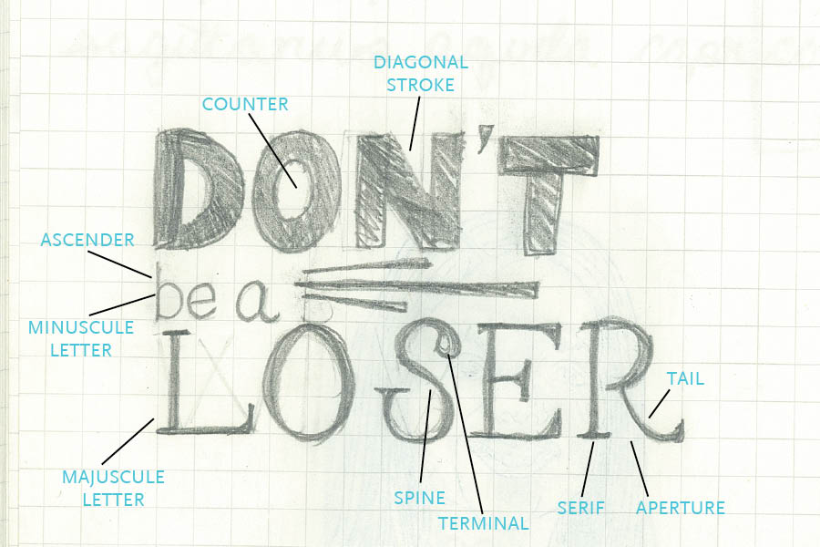
Base-Line: The invisible line where all characters sit.
X-height: The height of the main body of a lowercase letter.
Aperture: Opening at the end of an open counter.
Ascender: An upward vertical stroke found on lowercase letters that extends above the typeface’s x-height.
Counter: Fully or partially enclosed space within a letter.
Diagonal Stroke: An angled stroke.
Majuscule Letter: A letter or group of letters of the size and form generally used to begin sentences and proper nouns.
Minuscule Letter: small; not capital letter.
Tail: A descending stroke, often decorative.
Terminal: The end of a stroke that lacks a serif.
Serif: “Feet” or non-structural details at the ends of some strokes.
Spine: The main curved stroke for a capital and lowercase s.