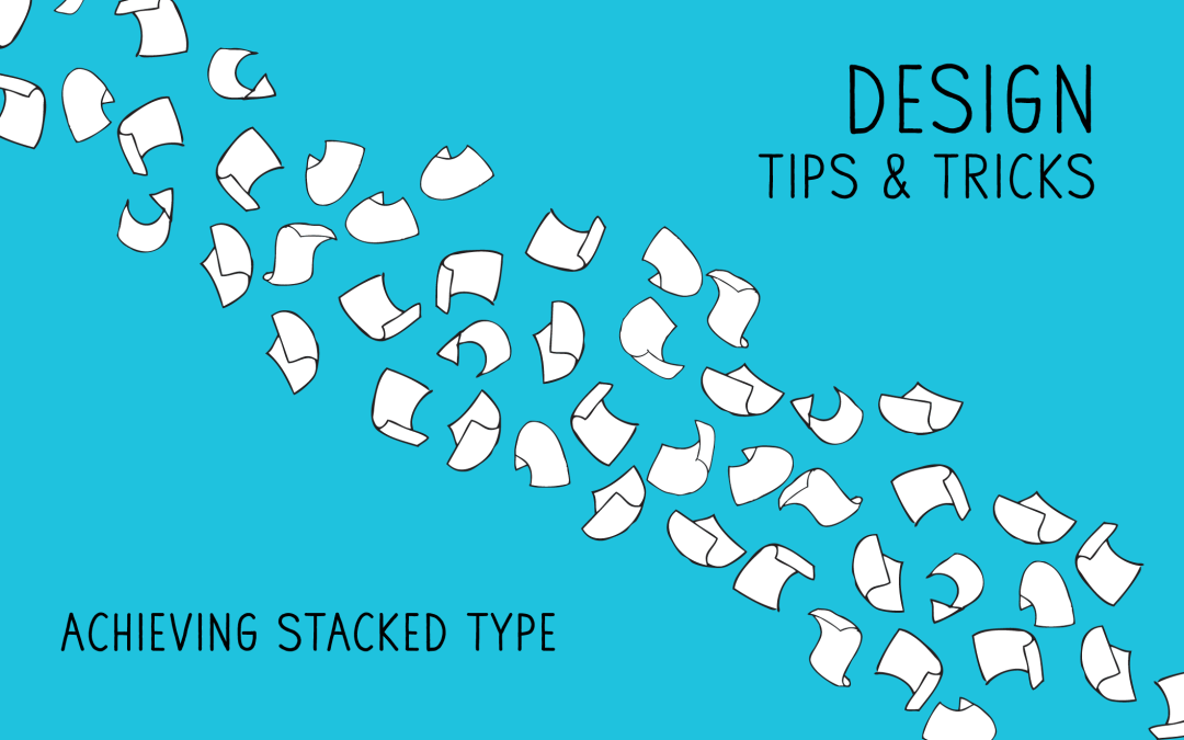
If you’re an avid follower of our humble little Blog, you’ll know that stacked type is all the rage in the design world right now. It’s a great way to add an dynamic element to any design, while keeping a clean and modern finish on the final product. An easy skill to achieve, stacked type will impress anyone, but there are a few rules to follow to make sure you pull it off successfully.
1. Length is key!
Not all quotes are created equally. When designing stacked type, you want to keep it short and sweet. Stacked type works best when the message is still readable. You’ll get the feel for the sweet spot to more you do it.
2. Scale, Scale, Scale
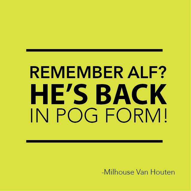
Size is important. Scaling your lines of text will help the reader get to the core of your message. Generally speaking, you want the most important part of your quote to be the biggest part of the block.
3. Gain Weight
The only time when gaining weight is good! In addition to scaling, font choice helps draw the reader in and makes the stack dynamic. One can achieve this dynamic effect by choosing two different (but complimentary) fonts or using one font family that has a wide variety of weights. The quote above is set entirely in avenir.
4. Don’t forget your element friends
Just because stacked type is type based (duh) doesn’t mean you have to forsake your other design elements. Dots, lines, squiggles, or whatever floats your boat can help in creating fun dynamic size differences in your quotes.